In the late 1800’s America, was trying to make a name for itself. We began associating our self with the word modern. Designers, such as, Mckim mead and White and Louis Sullivan began toying with ideas like heightening the skyline decorative exteriors, and masonry. The use of straight lines and bold colors began to be a trend during this time.
One of the most acclaimed designers during this time was Frank Lloyd Wright. Wright began to make a bold statement in his architecture by using dramatic lines. A lot of his designs had Scandinavian influences. The world fair was a away for different countries to showcase their latest designs and ideas. Before the world fair the appearance of different countries was not as relevant in the design world because people did not travel as often. The world fair brought the ideas of multiple countries to one place at one time. The idea of straight lines and bold colors was a common idea in Scandinavian design. Wright took advantage of these. You can see it greatly in his most famous design, Fallingwater. Fallingwater water was built on a side of a mountain right above a river. The idea of the house being built into the landscape is an understatement. The house is built around the side of the mountain. For example, a rock that is on the side of the mountain is used as a piece of the floor instead of being removed. The use of iron and glass in the house shows the influence from the world fair. Fallingwater resembles the crystal palace that was built entirely our of steel and glass. Wright not only made a bold statement in his architecture but also in his private life. America is famous for the deceit and affairs within the corporate world. Wright was no stranger to these things as well.
At the same time the art deco movement was going on around the world. The art deco did not really spark from anything, but was more design without precedent. The many names for this Art Deco period show the relevance of it throughout the world. The Art Deco world strayed away from the bone like structure with just glass and steel. The Art Deco added the skin to architecture. They also liked the appearance of curvilinear shapes, not rectilinear. The designers liked fluidity and connectivity. In Antonio Guadi’s design of Casa Mila, he demonstrated the use of curves very well. The out side of the building looks as if it is a layer of skin draped on top of a steel skeleton structure.
From there we transition back into straight lines and glass. Designers also began to use the height of the sky to their advantage. The realized that with the technology that they had they were able to create large buildings in a small amount of space. For example, The Seagram building in New York City stacks glass boxes on top of each other. They begin larger on the top and start to get smaller on the top. These buildings also use the ideas from the Grecians of the porch court and hearth. The outside of the building is the area in which the guests enter and are received. They are then welcomed into the court, which is usually the reception area of the building, which they are then directed into the hearth of the building. The hearth of the building would be the private office areas towards the top of the building.
Now that the American public is more concerned about their wealth and outward appearance, homemakers begin to design their homes. This is the birth of interior decorating. It begins as hobby but then turns into a profession. The media highly influences design at this time because the socialites within the city begin to showcase their work in popular magazines and newspapers that are see throughout the United States. Media also begins to show off different architecture that is now seen throughout the country. The problem with media so highly influencing design is that sometimes it is not translated correctly. This begins somewhat of a design flurry throughout the world with different design languages mashed together. Media turns into the modern version of world fairs. Due to technology it becomes easier to share different designs.
Friday, April 29, 2011
Monday, April 18, 2011
BP13
Scandinavian design has a legacy that is somewhat overlooked. Many designers think that they are designing things that are "modern" because they are using straight lines and mute colors, but really we get that influence from Scandinavia. There legacy is throughout the world but often times designers credit themselves and our decade for being to modern when in reality we are being highly influenced from the past.
Eames Legacy
Today in class we discussed the importance of having an education in design and how that relates to the legacy of the Eames versus the legacy of HGTV. I think that it is possible for an individual to be a great designer while not having an education, but I also think that having a degree in design has more benefits. The design that one sees on HGTV is usually done on a time limit, therefore there is not a lot of thought put into it. I think that one thing that school helps you do is have a thought process to it. It helps by not going by your first instinct or something that you like, but something that is functional and will last. The design that is on HGTV is also very mundane. It is something that looks good, but you have seen it a million times. Being in school it teaches you how to push the boundaries on things and develop a concept. It also gives you the skills to be able to develop and create your idea before you actually execute it. It teaches you the skills to be able to render and draft your ideas out and see if they will work or not
Something that the Eames portray well is the sense of concept and belief. They are able to execute their designs well. Even today their furniture is able to be used and fit in perfectly because they were trying to do something that was different than what has been done. They made them with good craft so that they would last as well.
Something that the Eames portray well is the sense of concept and belief. They are able to execute their designs well. Even today their furniture is able to be used and fit in perfectly because they were trying to do something that was different than what has been done. They made them with good craft so that they would last as well.
Wednesday, April 13, 2011
BP12
good design for all.
the dyson ball vacuum is good design because it is very pleasing to the eye. it is also very functional because in its design because it easy to use. before you even see how well it works you are drawn to the machine.
Monday, April 11, 2011
Friday, April 8, 2011
US 2
 |
| Church of Holy Sepulcher |
As we learned in the previous unit, temples and churched were using two main themes. They used the circle, as seen in the Pantheon. They also used rectangles, like the Basilica in Rome. The architects begin to incorporate these two ideas. They are incorporated in many different ways. The Church of Holy Sepulcher combines the rectangle with a half circle on each end. The Church of Nativity uses two overlaying rectangles and three half circles. St. Peter’s basilica uses circles on each of the four sides of the church.
 |
| Church of Nativity |
 |
| St. Peter's |
- Revive the past using classical languages
- Strive for harmony and order in all things
- Layer groves and stacks when possible
- Emphasize surface through materiality
- Follow the rules
- Place man at the center
- Strive for a positioned throne
- Get some perspective
- Expand your physical world.
I think that they are more of guidelines rather than rules. It is the job of the architect to take the rules and translate them into their own design language. The main idea between these rules emphasizes on the architecture being influenced by the past. Also the idea of uniting with each other. The Renaissance is a style that was not one for trying to stand out or standing out for the classical era.
 |
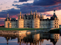
| Chateau de Chambord |
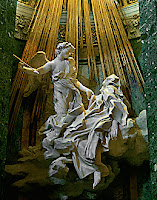
ChaOnce the rules are made, the first thing to do is to break them. They start to use more of their own ideas as architecture rather then trying to recreate the past. They tend to pick and choose elements form the past and blend them together. For instance, the Chateau de Chambord, in the words of Patrick Lee Lucas is “architecture on crack.” It combines the classical nature in the three stories of the palace, and takes the gothic nature and puts it on the roof. They also start to utilize the landscape. Chateau de Chambord is a perfect example of the house being built into to ground rather than on top of. The architecture also becomes more fluid. Rather than straight lines, they start to uses curves. In Chateau Fountainbleu the curved staircase allows your eye to easily glide up to the building. The interesting thing about the building is that it is not symmetrical. It looks as if they were trying to trick the eye into thinking it is symmetrical, but with a closer look you can see that the features are not symmetrical. This shows the Renaissance striving for independence. The Renaissance also liked to intertwine the senses in architecture. In Bernini’s Cappella Cornaro, he tries to heighten the sensed by illusions. He designs the sculptures so that when the light strikes them it looks like fabric rather than stone.
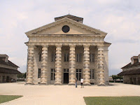
We then move into an era where architecture is not quite making sense. In Ledoux’s Saltworks there is highly detailed classical detail on the front, but the building’s use is intended for a factory. It looks more like a building that is intended as a temple or church. This is the first time you see this amount of detail put into an industrial building. I believe that this building aids the fight of engineering vs. architecture. In Christ Church in Spitalfields, the building is in the middle of the city and is on a small ploy, but Hawksmoor decided that a nice tall steeple on the top of the church. This doesn’t make sense to put the steeple so high when the building rises low.
The industrial revolution inspires the use of steel and glass. The idea of architecture also turns back into the idea of glorifying ones self. The crystal palace was an exhibit intended to show off all the king’s treasures. It was also designed to be temporary. This was the first structure of the style so it was coined as the first modern structure. The interesting thing about this was that the pieces inside that the king was showing off were classical pieces from the past. So the interior again is different from the outside.
 |
| Salt works |
 |
| Christ Church |
Wednesday, April 6, 2011
Tuesday, April 5, 2011
OH NOO! MONTY IS PLAYING HIS CELLO AND ZE WATERS ARE FALLING!!!!!
The trip to Monticello and falling waters was PHENOMENAL. It is hard to decided which one I prefer because they are both breathe taking. So here are a few things that I liked and did not like of each places. Pro and con list always help the thought process.
Monticello:
Like:
-I liked the the symmetry of the building. I liked this aspect because there is a sense of predictableness of it. I like being able to picture what it is going to look like.
-I liked the landscape. I feel as it the house is in charge of the land it is on. Even though it is on top of a hill that is far larger than the house, Monticello is still the dominate feature. I also feel like the house is reaching out to the lawn like it has imaginary arms.
-I liked the history of. We got to see the bed where Jefferson died! How cool is that?! The house is very nice, but it is something that could be repeated easily. But the fact that it was Jefferson who lived and died there makes the house.
-I liked the servant quarters because they were hidden under the house. The tunnels the were down there interested me because it gave a perspective to not only Jefferson's side of the house, but the slaves and servants. The tunnels were also interesting because it shows that they liked to keep stuff hidden. The lingering thought of whether there was more hidden aspects in Monticello that we still don't know about still intrigues me.
Didn't Like:

-I did not like the cemetery. Even though it was located on the outside of the landscape, I feel as if that is

-I liked all the terraces that stretch out to the river. It shows how the house tries to reach out to nature. It also shows how important nature is to the house and the designer.
- I liked the vines that came over the the outdoor patio because they also showed how the nature reaches out to the rest of the house.
Didn't like:
-I did not like the statues that were around the house. There were a lot statues that reflected multiple religions and cultures. I know that they were a very wordily family but I prefer a trend.
-I also did not like the open space that was right passed the house. The house was in the center of the woods, but when you walk a few feet out in turns into a field.
Final Decision: After this list I think that I prefer Monticello. I like the symmetry and pridictable aspects of it. I like the history that it has and everything that it holds.
Didn't Like:

-I did not like the cemetery. Even though it was located on the outside of the landscape, I feel as if that is
Fallingwaters
Like:
-I liked the stairs that go straight down into the water. Frank Lloyd Wright took a lot of risks building the house. The risks that are taken are proven in this stair case. It is interesting how the risks are taken are transmitted into the steps. There is a danger in butting the steps that go straight into a bustling river and it interests me.

-I liked all the terraces that stretch out to the river. It shows how the house tries to reach out to nature. It also shows how important nature is to the house and the designer.
- I liked the vines that came over the the outdoor patio because they also showed how the nature reaches out to the rest of the house.
Didn't like:
-I did not like the statues that were around the house. There were a lot statues that reflected multiple religions and cultures. I know that they were a very wordily family but I prefer a trend.
-I also did not like the open space that was right passed the house. The house was in the center of the woods, but when you walk a few feet out in turns into a field.
Final Decision: After this list I think that I prefer Monticello. I like the symmetry and pridictable aspects of it. I like the history that it has and everything that it holds.
BP11
Keeping Up With the Joneses.
WHY IS IT SO IMPORTANT TO TRY TO BE MODERN?
WHY MUST EVERYBODY HAVE THE LATEST THING?
BECAUSE LIFE IS JUST ONE BIG COMPETITION.
Subscribe to:
Comments (Atom)


